HOW TO BUILD A NEAR COMPLIMENTARY COLOR COMBINATION
Creating a color combination is something that a lot of people struggle with, but guess what? I love combining colors.
You will too, I promise.
On the surface, it may seem simple but color theory is actually quite complex. Coming up with a great color combination takes a great eye and a bit of science.(Don't freak out y'all! I promise I'll give you some practical tips and not a headache)
In addition, building a brand image that lasts has a lot to do with color. This fun and interactive lessons will help you not only find colors for your style, but also for building your brand.

Alright, first things first. You're probably looking at your computer like:
"Tiff, what the heck is a near complimentary color combination?"
Don't you worry, because I'm going to tell ya!
A near compliment (or split complement) implements a color directly next to another colors complement.
Here is a visual:
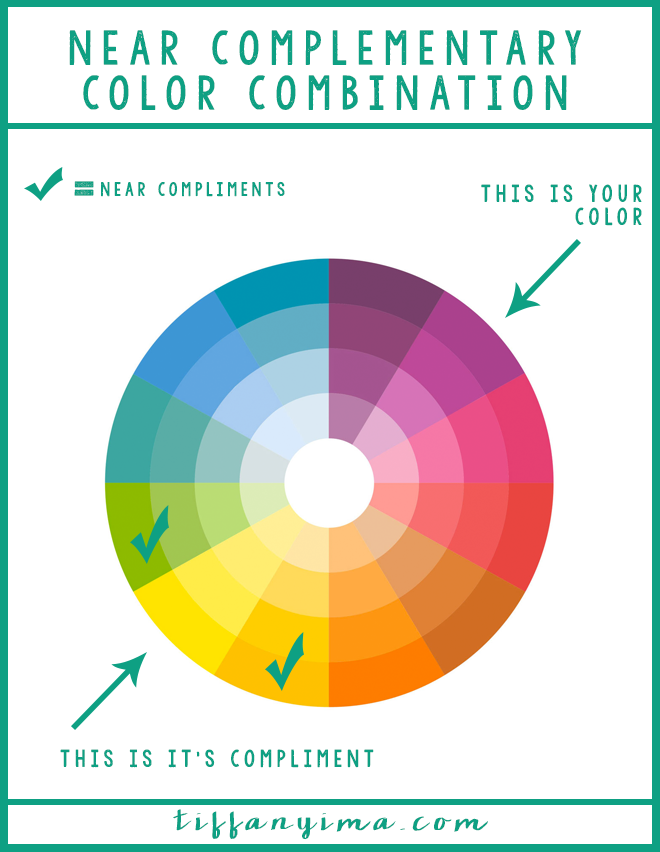
Complementary color schemes are awesome, however, you may not want that much contrast. Colors opposite of each other force each to stand out you would appear to be a walking vibration. (I'm fa real, yo) Using a near complement color combination creates optimal contrast and a truly interesting spin on any of your outfits. (Plus, you'll look like a freakin' genius) The trick is subtlety.
Stick around to the end of the post to get the fall 2015 color combination guide!
CREATE A BASE
You'll want to select your main color first. I recommend it be the darker of the two colors if you are hesitant about a palette like this. Opt for a monochromatic base that you can add the near complements to it. The trick to a subtle near-complementary scheme is to add the contrast in the details. . You could easily exchange the jacket or shirt out for denim, or wear a white or gray top as well.

FILTER IN THE DETAILS
A headband is a perfect accessory to add contrast. It is not directly next to your main color but still packs quite a punch with subtle intentionality (Ooh, I just love that word!)


Since this is a simple outfit, a statement necklace adds just the oomph you need to make it pop. The colors in this particular one fit well with the purple shirt. The orange and green jewels stand out against the purple and draws attention to the neck. (If you need a statement necklace, The Happiness Boutique has a BUNCH of gorgeous options in many colors! The free shipping and rewards are a pretty sweet deal too!)

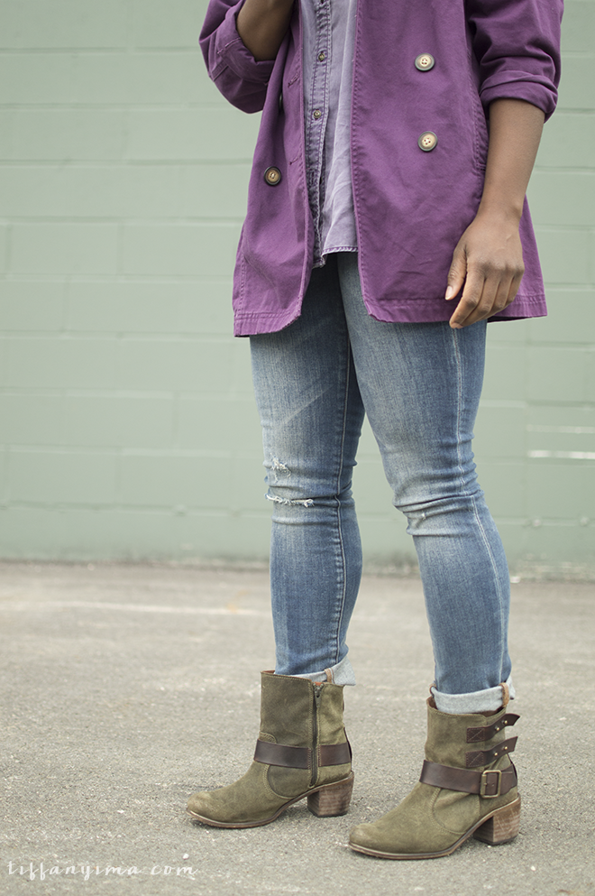
The green boots were the final touch. You could wear brown boots with a look like this, but the boots actually play on the color in the necklace - I think that's pretty sweet. It adds another element to the near complement scheme without detracting from the statement necklace.
Don't let the red glasses fool ya! It is not a near complement to the purple and actually adds another element of color theory that we will not get into today. They look pretty sweet against that purple, though!
RECAP
A successful complementary color combination has.
√ A MAIN COLOR BASE
√ SUBTLETY
√ FOCUS ON THE DETAILS
Now that you know what a near complementary scheme is, go out there and be epic. Oh and if you need a few more ideas, sign up for the newsletter and get a FREE near compliment color palette for every single one of Pantone fall 2015 colors!