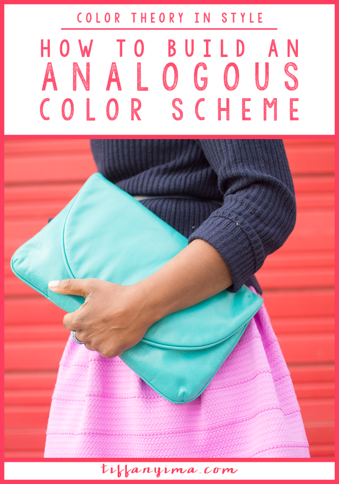
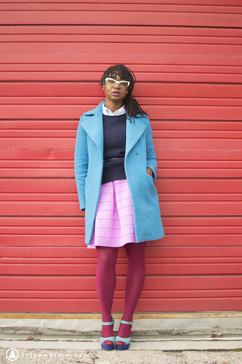
HOW TO BUILD AN ANALOGOUS COLORS SCHEME #COLORTHEORYINSTYLE
Welcome to Color Theory In Style, a fun and practical approach to learning color theory.
Color theory is used every single day in business, art, and style. I want to empower you with knowledge so that you can effectively implement color with planning and strategy. Utilizing color to build your outfits is a great way to build your knowledge in color theory. My goal is to teach you to recognize the different type of color combinations and apply them to your own work and style.
As we move through the different types of combinations, I will start posting each outfit and asking you to identify the type of color scheme.
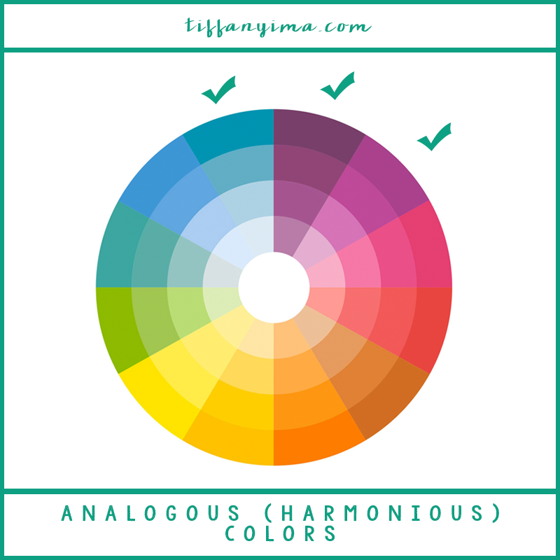
Last time, we talked about near compliments, and today we will talk about my favorite analogous (harmonious) color.
Analogous colors are those that are right next to each other on the color wheel. They are popularly used in home styling and found in nature as well. Since nature produces analogous schemes we recognize it as calming!
The first thing that you want to recognize is that when you are getting dressed, the color combinations you create may not be EXACTLY the theoretical scheme. That just means that the colors are most likely not going to be in the exact spot on the color wheel. As long as you can identify the combination in a specific category, I am an extremely happy and utterly proud teacher!
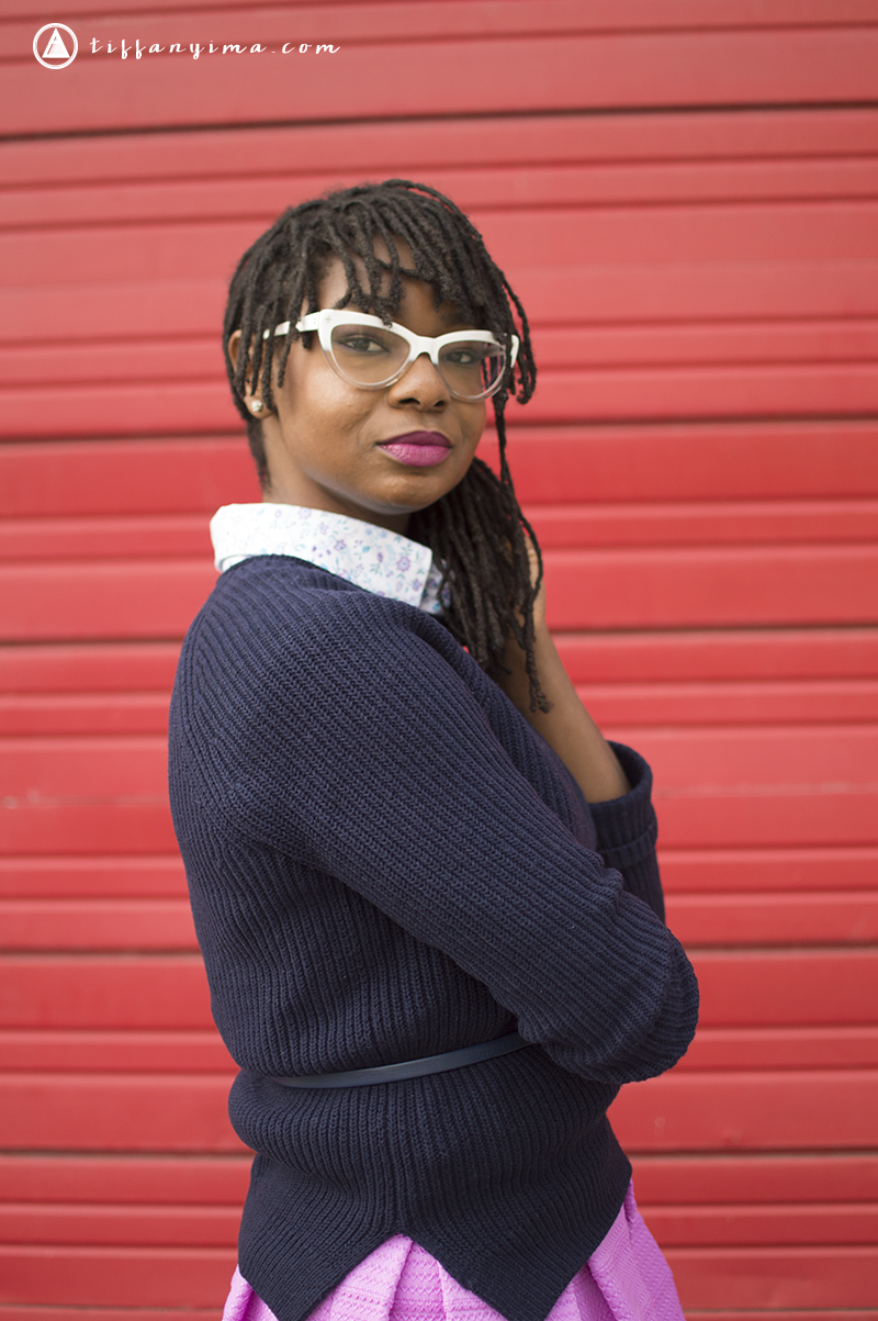
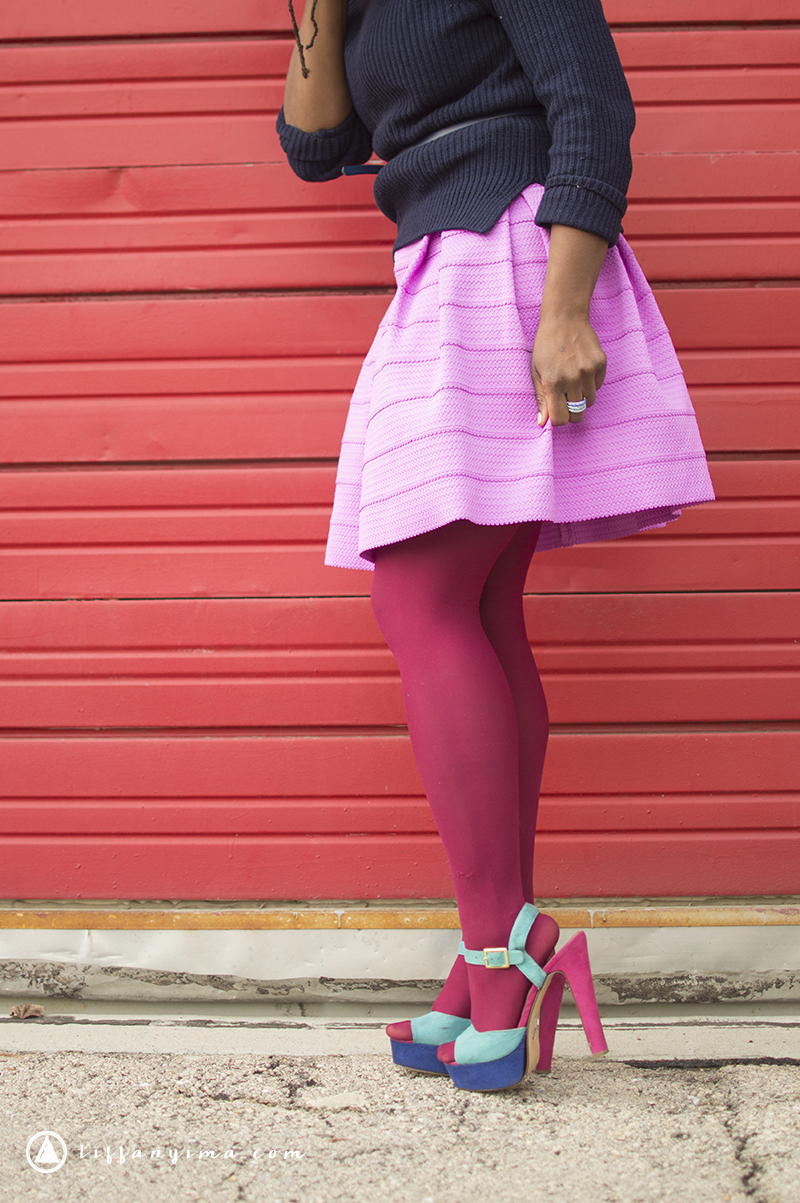
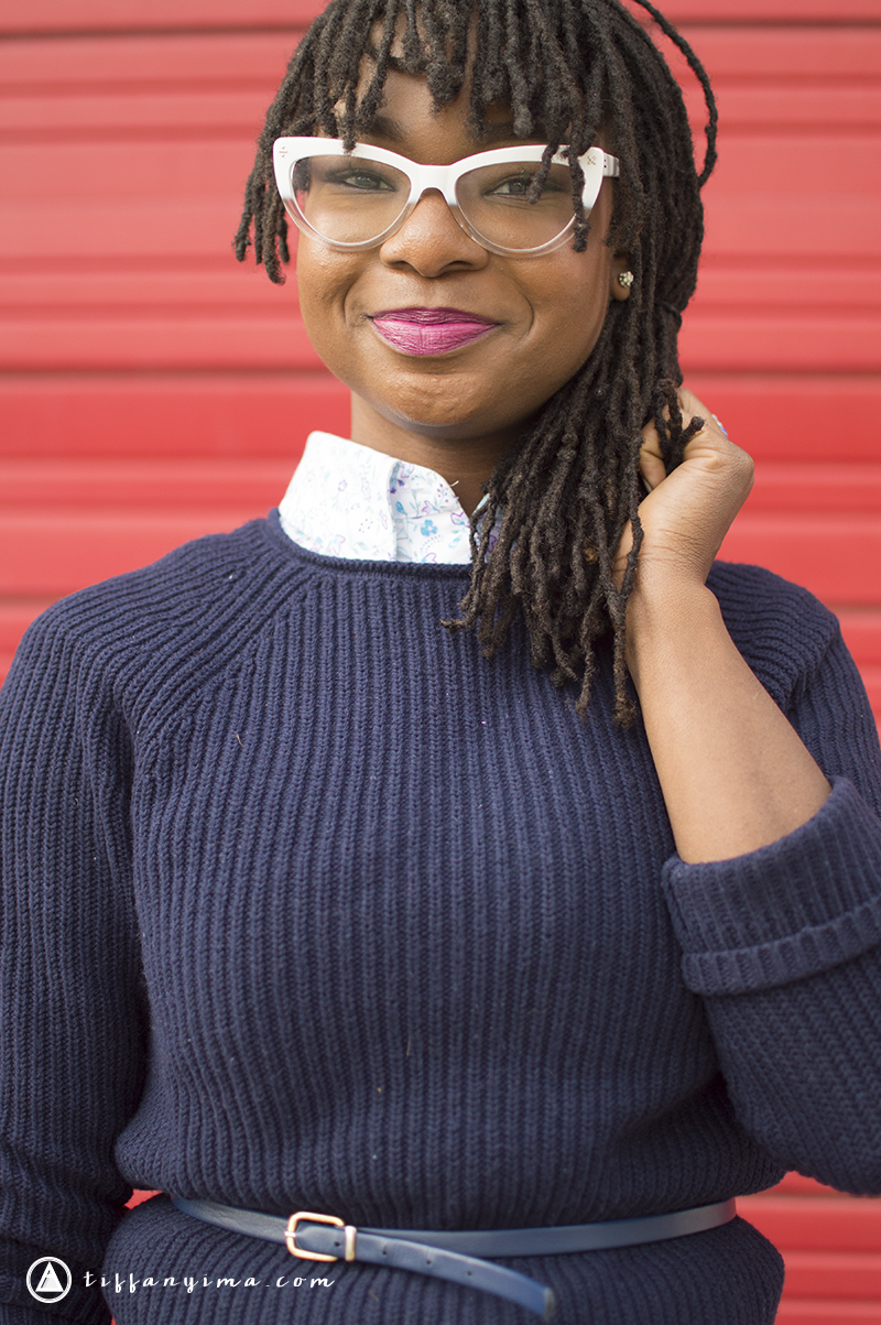
The main characteristic of an analogous combination, is that the colors create a harmonious appeal. This type of combination is awesome for someone who is trying to create a calm environment, or something that is pleasing to the eye.
The colors work together to create a unified look that is interesting and peaceful. It is pleasing to the eye but does not have the same effect of contrasting colors that shout for attention.
Blogs and business who want to create a look that is inviting and warm could choose an analogous color scheme because it will be a visual representation of amicability.
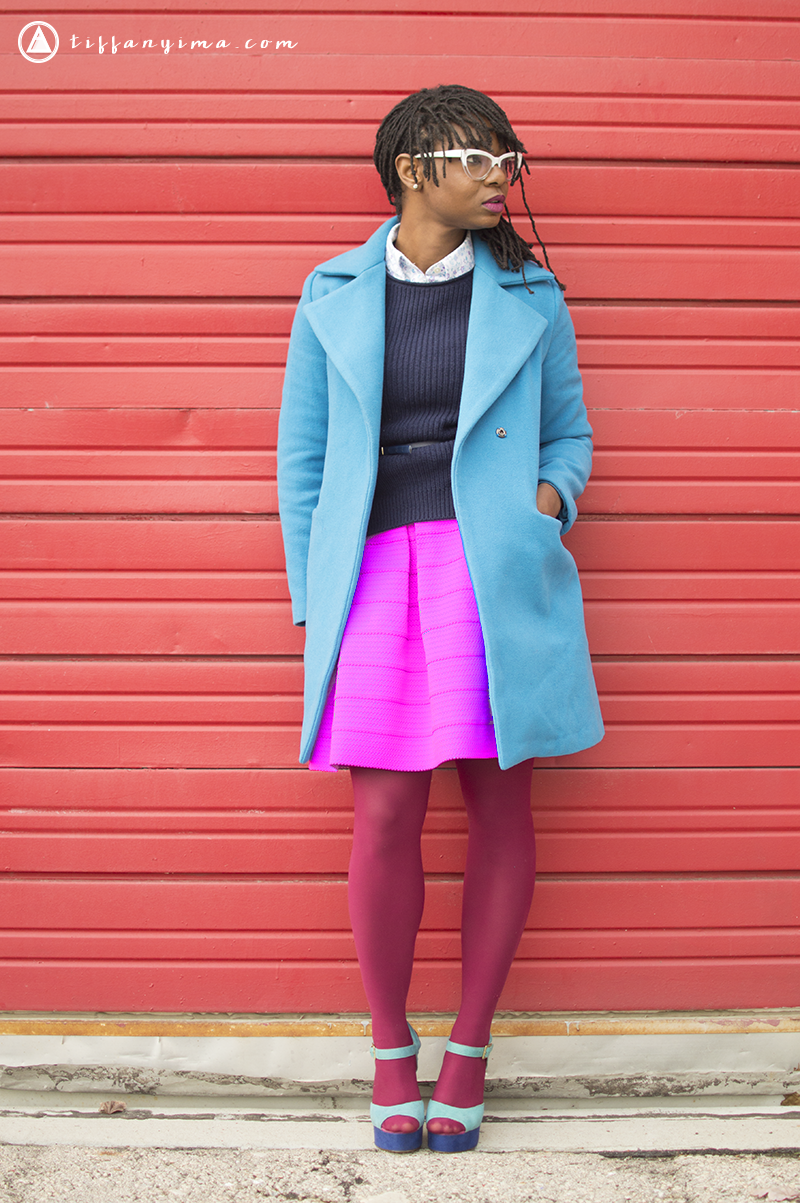
When choosing harmonious colors, it is important to consider the saturation of each color.
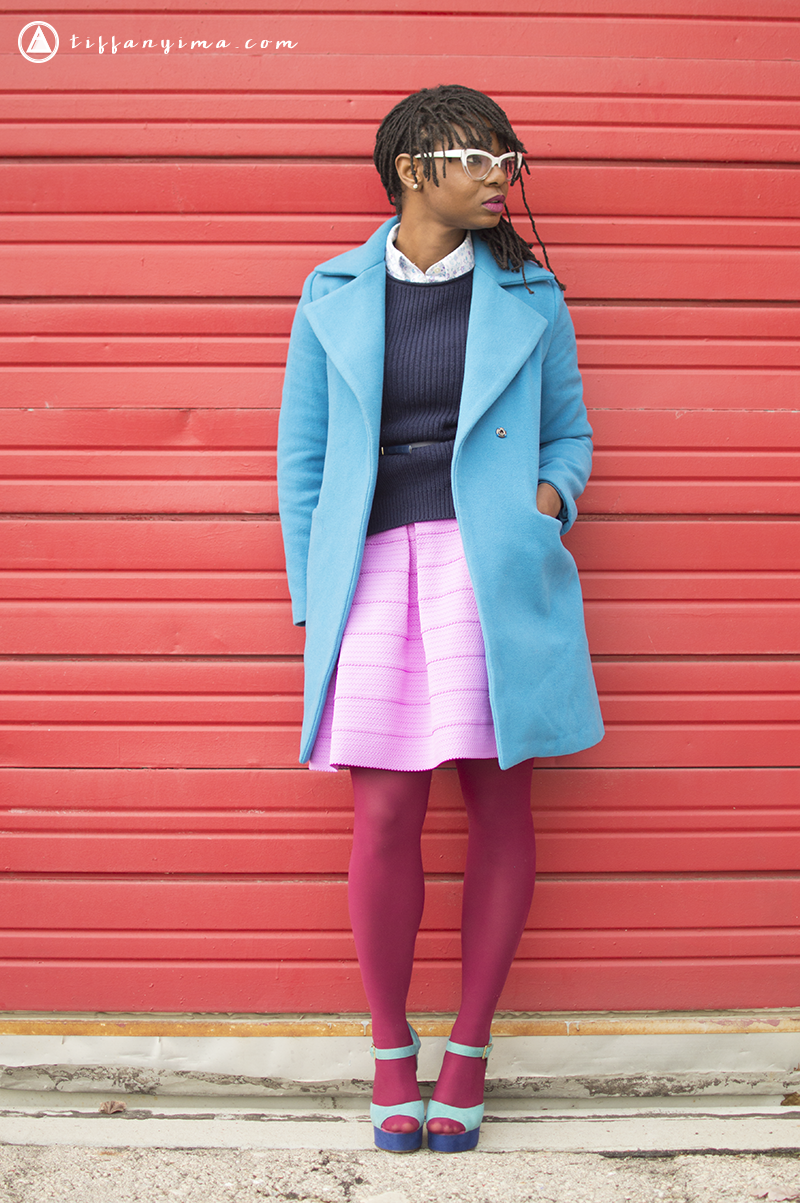
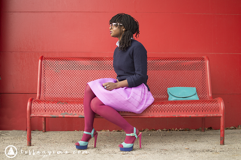
Look at happens when I tip the balance of the color saturation. Now when you look at the outfit, you are drawn directly to the skirt instead of all the colors working together as one unified look. When you look at the picture below, you take it in as a whole.
Each color should be just about the same value to keep the entire scheme harmonious and calming.
Now that you know all about analogous colors, tell me how you will use them in your style or on your blog.
Also, feel free to invite your friends to join in on the fun!

