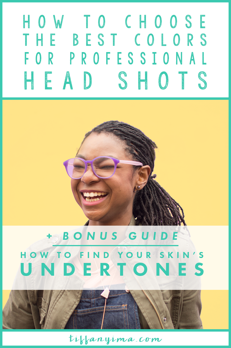
HOW TO CHOOSE THE BEST COLORS FOR YOUR PROFESSIONAL HEADSHOTS
Color has the ability to affect emotions and moods.
When you need to influence your audience, picking the right colors to wear for your professional photos will help set the tone for your message. Since your headshots will be used on your website, during launches, and for webinar invites, you want to make sure that the photos represent your business well and are captivating.
Color plays a huge role in making sure your photos shock and awe your audience. This post is for you if you often wonder what colors look best on you and how to chose the right ones for your professional photos.
KNOW YOUR UNDERTONES
Undertones are the colors beneath the surface of our skin. They will either be warm or cool, an the most important piece of finding your best colors.
Knowing the temperature of your undertones is the most effective way and the first step to choosing the right colors for your photos. A picture is chronicled forever, and the last thing you want is to wear a color that doesn't flow with your natural coloring. The colors you choose should harmonize and highlight your features. Undertones will either be warm or cool, not neutral. Most people have a blend of warm and cool, but will lean toward one or the other.
For example, I have warm undertones. It becomes very apparent in this photo specifically because of the orange lipstick I am wearing. See how the color flows naturally with my skin? The blue in the shirt I have on is natural contrast to my undertones therefore highlights my features. This is the kind of natural flow that you want with all of your images.
Grab the How To Find Your Undertones Guide here!
KNOW YOUR INTENSITY LEVEL
"Tiffany! what do you mean my "intensity level!?"
Your intensity is how bold or muted the colors in your skin are. This can also be referred to as saturation of color. Some people can handle extremely saturated colors, but they can be overpowering on others. The image below shows one hue (color) that has progressively more gray added to tone it down, the last color obviously being the most muted.
People who can handle the boldest colors generally have high contrast between their eyes hair and skin.
The far left is the most saturated. Adding gray lowers the intensity of the color.
Someone who has a low intensity level will have less contrast with hair, eyes and skin. Their overall appearance will look softer and blended. Often, they will be mistaken to have "neutral undertones, which do not actually exist. Take a look at Kaitlyn from The Crown Fox. See how her eyes and hair have the same value and not a lot of contrast? It gives her a smooth and soft look. Kaitlyn will look best in colors that are more desaturated, like mustards and olives. To demonstrate even further:
See how the muted yellow (right) flows better and harmonizes with her skin tone instead of overpowering her look? The differences are easy to miss but will affect the way you appear to others on a psychological level. If Kaitlyn wore a shirt in the brighter yellow, it would overpower her, while the muted version harmonizes with her hair and eyes. Keep in mind that if you love a color that doesn't look the best on you, you can always wear it on the bottom (skirts/pants) or in an accessory that is not close to your face.
When choosing your colors, pay attention to what bold and muted colors do to your overall look.
* I would never perform a color analysis from one photo. I use 5-10 photos before defining the undertones for a client.
MATCH YOUR MESSAGE
How does your audience want to feel when they encounter your brand? What colors represent the general mood of your audience?
The colors you choose for your professional photos should reflect the message you wish to project to your audience. For example if your message was
"Stress free business for the busy entrepreneur"
you would consider choosing very calming colors like blue and green. Colors like red and orange would be too energizing to reflect a calming message.
MATCH YOUR BRAND'S COLORS
Taking photos that flow with your brand colors is the best way to show you "live your brand" This screenshot from Heather Crabtree is the perfect example.
The biggest question people ask me is if they should wear black for their headshots. I follow up with two questions:
"Is black in your branding?" and "does black look good on you?"
The most important thing to remember about color theory in style is that it matters most from the waist up – or the colors closest to your face. If black makes you look dull, you will want to consider something else. Neutral feels safe for most people but wearing color that makes you look outstanding is better.
Here is an excellent example from Jessica over at Love + Color. She is wearing black, but kept it interest with a black and white stripe. She could have worn a bold yellow to draw in her colors, but she chose to bring the color in with the flowers.
The next question I get is
"What if I don't look good in my brand colors?"
That's easy.
Just wear a color that looks good on you but compliments colors in your brand. That way, when people scroll through your website, your photo will flow without interrupting the experience.
At the end of the day, your photos are going to enhance your audience's experience and provide them with an opportunity to interact with you. Wearing colors that reflect your brand in addition to your personality will serve as a toll to communicate message.
Let your audience get to know you so they feel they are buying from a friend.
Now that you've learned how to choose the best colors for your professional head shots, it is time to put it into action. Click below to grab the How To Find Your Skin's Undertones guide to complete the first step in finding your best colors!


