HOW TO FIND YOUR SIGNATURE COLORS
There is a group of colors out there that will make you look like da bomb.com. I'm here to help you find them.
The colors you choose to wear can change the way you feel, and affect how other people see you. When I wear a color that I KNOW looks great on me I feel like I'm saying "look out world, here I come!" and I am 100% positive that I exude that confidence outwardly. I want YOU to feel that way about what you wear. Every. Single Day.
The good news is that there are some tips to help you look your best all the time. I bring to you a three-part series that will help you to find your signature colors and why you should want to find them.
When you find your signature colors, you don't necessarily have to wear them every day. The goal is to find a group of colors that you repeat often to develop a consistency with your wardrobe. I am a huge proponent of being able to wear any color you want you just have to find the right shade for your complexion. Choosing a group of signature colors will help you develop a great mix and match wardrobe providing functionality and easy outfitting.
In this series, I do not aim to give you three-set colors that will look good on you. I want to help you understand color as it relates to your complexion. We will look at three groups to help find your signature colors and develop a twelve color base for your wardrobe. These twelve colors will help you to make getting dressed much easier!
WHY 9 COLORS?
The idea is that these nine colors will provide enough variety, yet establish consistency in your wardrobe. The colors will be versatile enough that you can combine any two of them or wear any on its own.
WHAT IS THE FORMULA?
By the end of this series, I want you to find three colors in each of following color groups:
NEUTRALS
WARM COLORS
COOL COLORS
I'll even show you how to do substitutions if you decide that one group is just not what you want. Either way, you will have 9 colors that look wonderful on you!
A few little detailsI have chosen to omit white and black from your set palette (unless you want it there!). The reason why is because these are colors that most people will have. I have black in my closet because I know there will be a time that I will need it, however, I don't wear it regularly.
Second,denim colors don't count. Let's face it, denim is an all around neutral and everyone will have multiple washes!
COLOR RESOURCES
Before we look at your colors, I want to introduce you to the concept of finding your best colors and provide a few resources that you could look at for a little background information. A lot of people have put in a lot of work into developing a process of finding your color. You may have heard of books like Color Me Beautiful and Color Your Style which use seasonal color analysis to help you determine what colors look best on you.
Color Your Style by David Zyla looks a little deeper by breaking the seasons into different types and looking a little closer at the multiple colors that are found in your eyes, skin and hair. Books like these help you to develop a deeper understand of color in general and develop an eye for identifying your own coloring. The last book I recommend is Color Revival by Lora Alexander. It breaks down the 16 season analysis very well!
The seasonal color analysis is extremely helpful, and a very accurate way to develop your palette, and my methods of color analysis is based on this plus my own experience with color theory and style.
COLOR THEORY BASICS
Hue: Color in it's purest form.
Tint: Hue + White
Shade: Hue + Black
Tone: Hue + Gray
Intensity: How bright or dull a color is.
Check out this website. It also shows you some really cool stuff about color context.Finally, I think it is super important to know just a few color theory definitions. During the series, I will use some terms that you will want to know! If you are left wanting more definitions here is a great resource for you. (Yes I am aware that I may be the only nerd who wants to learn about color theory definitions, but I promise I'll only use basic ones!)
COLOR PAIRING
Complementary Colors
Colors that are opposite on the color wheel. Examples are purple and yellow, red and green, blue and orange.
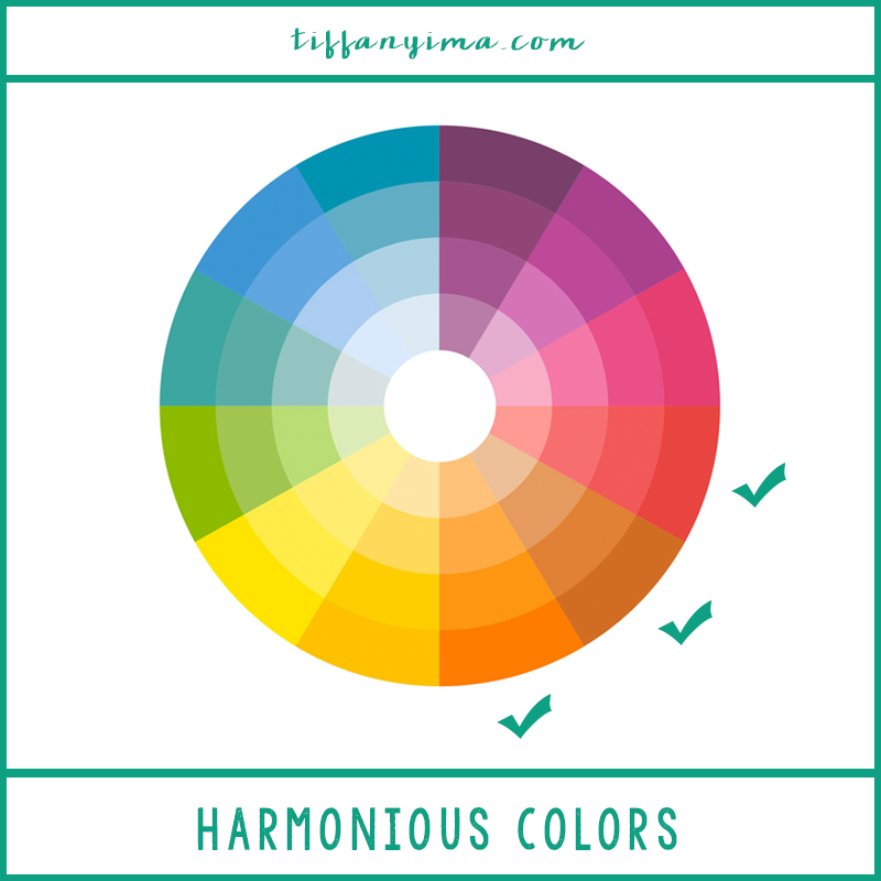
Harmonious Color Theory
Colors that are next to each other on the color wheel.
Triadic Colors
Colors that are evenly spaced from each other
THE EFFECTS OF COLOR
I was scrolling through my Instagram feed and I noticed something really cool - whenever I wore certain colors, I had higher likes on my profile. I'm not kidding! Currently, my average Instagram likes are about 120 - 140. Here are some examples:
Every single time. (Note that the top right-hand photo was posted when I had about 900 followers and averaged 50 - 75 likes per photo)
Sometimes the colors were more saturated, sometimes more muted but overall I was able to pull a palette based on these colors.
Even further than that, I pulled my brand colors DIRECTLY from images. This is super important that I chose colors that matched my personality and my brand.
READ: THE 5 CRITICAL ELEMENTS OF A POWERFUL BRAND IMAGE
In regards to my wardrobe, I then Identified 9 colors that I would base the majority of my wardrobe on:
Once I identified my palette, I paid more attention to buying colors within this range. The great thing is I would definitely wear any of these colors together.
Do I buy more colors than these?
Yes, friend. Yes, I do.
The thing is, I love color matching so it's nothing for me to pop a few more colors in my wardrobe. Generally speaking, the colors I wear fall into this nine color palette. My goal is to help you create a guide you'll walk away with 9 colors that you love and will look amazing on you!
THE GROUND "RULES"
Before we start picking colors, you'll want to understand your undertones and seasonal color analysis! Check out the Introduction, here!
Now that you've discovered whether your undertones are warm, cool, or neutral, let's get started.
1. DENIM DOESN'T COUNT
You don't need to add denim color into your palette. Denim is not now, nor should ever be limited. Now go and bask in all your denim.
2.BLACK AND WHITE DON'T COUNT
Similar to denim, black and white are colors that most people will have in their wardrobe so you don't have to include it in your 9 colors unless you want to!
3. BE OPEN
You might be reading this and your current wardrobe is all neutral. Friend, if this is really what you want, then by all means! However, if your desire is to add a bit more color, you're in the right place!
In addition, thinking about color is usually general for most people. Colors are placed in groups of warm and cool, but I want you to open your eyes to more possibility and begin to understand how subjective color is.
Let's start with your three warm colors. Warm colors are the vibrant hues that represent more passionate emotions and every single person has a set that looks wonderful on them! I'm uber excited to help you find yours! The basic warm colors are red, orange, and yellow, each representing a feeling or emotion. Let's dive into the basic meanings of the main warm colors!
RED
Red is the color of romance, passion, anger and power and when worn correctly,
ORANGE
Orange is a very positive and uplifting color that is very inviting. This is why a lot of restaurants choose to use it in their design.
YELLOW
The color of joy, innovation, and the sun, yellow can be very stimulating and energetic.
UNDERTONES
Your undertones are THE most important factor in how you choose the colors you wear. They will either be warm or cool. Not neutral. There will a tip to either warm or cool even if you have elements of both tones.
First, slap yourself.
I'm totally kidding. Please don't slap yourself (although it would reveal your undertones pretty fast!)
Instead, go to the mirror and give yourself a little pinch. Like a baby. If you want to baby talk to yourself while you are in the mirror, I certainly won't judge!
Take a look at the tones Do they appear purple, pink, bluish, or olive? You have cool undertones. Yellow, peachy, orange tones means you are warm.
FINDING YOUR WARM COLORS
Alright, people, red, orange and yellow barely scratches the surface of possibility so let's dig a little deeper. First I want you to be aware that this exercise should not end with your finding a version of red, yellow and orange that you add to your palette. What I would like is for you to find a set of warm colors that you can work with. Here is an example of a deep warm palette
If you have a fairer complexion with warm undertones (Warm Spring)
This is the perfect example of amazingly subjective color is. Red became red-purple and yellow became green-yellow much more suitable for someone who has cool undertones.
COOL COLORS
Here is a sample from my own pallete. Notice anything about the purple?
It is very simialar to the "red" in the cool undertone warm colors above.
NEUTRALS
Just like other colors, neutral have a wide range of possibility. Considering your undertones again, you will want to choose neutral coolers that have overall warm or cool undertones to them. Here is an example:
On the left photo, the white is just ok, but when you look at the more peachy off white, it gives my entire face a glow, making everything unified.
Here is an example of warm vs cool neutrals.
By now, you should have a much better idea of what colors you will include in your palette!
Here are some palettes to inspire you!


